November 14, 2020
Flourish Preservation LLC
Digital Product
USA, NY
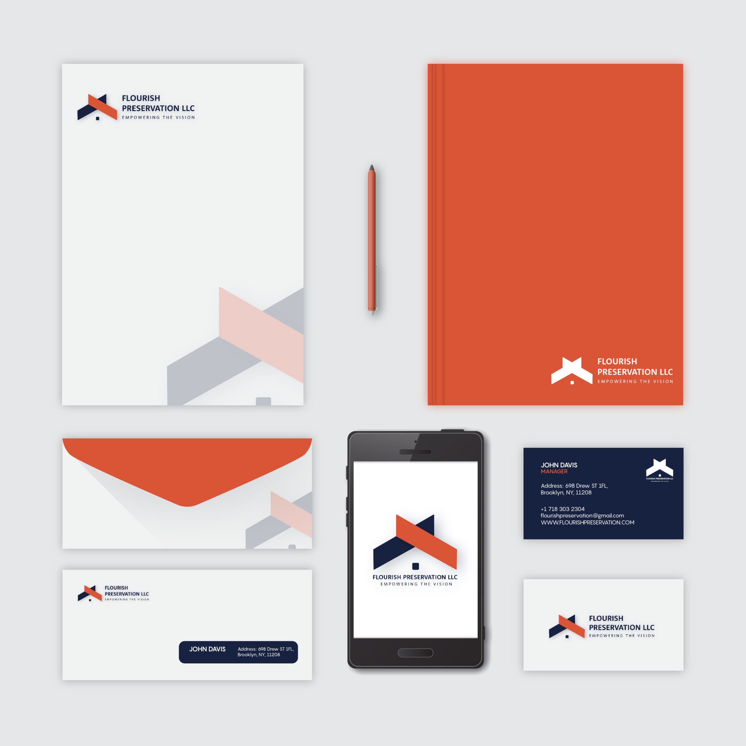
For Flourish Preservation, we developed a cohesive brand identity that captures the company’s essence and values. The logo features a modern, geometric design with a dynamic color palette of deep navy blue and vibrant orange. These colors were chosen to symbolize trust, reliability, and energy, reflecting Flourish Preservation’s commitment to innovation and excellence in property preservation. The combination of these colors creates a striking visual contrast, enhancing brand recognition and appeal. The typography selected for Flourish Preservation is clean and contemporary, utilizing sans-serif fonts that offer clarity and professionalism. This choice ensures that all text, whether on digital platforms or printed materials, remains easily readable and visually appealing.
In addition to the logo and color scheme, we extended the brand identity across various stationery and marketing materials. The ID cards, visiting cards, letterheads, envelopes, and notebooks were designed to maintain consistency in style and presentation. The deep navy blue serves as a dominant background color on the visiting cards, complemented by the bright orange accents, which add a pop of color and draw attention to the essential details. Each element of the branding, from the choice of colors to the layout of documents, has been meticulously crafted to reinforce Flourish Preservation’s professional image and establish a strong, memorable brand presence.